
“Mobile last” strategy approach with “Multilayered webforms presentation architecture” for ASP.NET Webforms and #EPiServer CMS 9, 8 and 7,5 #EpiDev #MobileLast
Hey EPiServer World, with you in mind! Stuck with an ASP.NET WebForms-solution with no responsive layout? And the owner won’t redo all web to MVC? Then here is the simpler way to go responsive… without rebuilding all and immoderate job effort from editors… only fun work for the web developers.
There can be several reasons why you just can’t upgrade, or you just don’t want a big project redoing all the web, involving editor redoing their content. If you’re pleased with your web, but missing a responsive site the easiest way is to only implement a responsive/mobile channel. Since you probably also stuck with Webforms instead of MVC, there is a way of implementing responsive channels without touching the web logic.
Are you still on CMS 6? check this instead.
Solution: Implement an alternate presentation layer, reusing the aspx code behind and display it for your target devices.
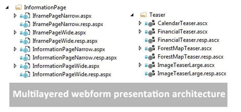
How can we do that? I call it “Multilayered webforms presentation architecture”
- For each .aspx and .ascx, make a .resp.aspx and .resp.ascx and point it to the same code behind. The .resp.aspx uses a masterpage with appropriate html and style. The resp.aspx uses reference to .resp.ascx. or original ascx (not all ascx needs to be changed if there only is CSS changes).

- Register an DisplayChannel for “Mobile”
using System.Web; using System.Web.WebPages; using EPiServer.Web; using Holmen.Externweb.Common; namespace Gosso.EPiServerStuff.Channels { //<summary> //Defines the 'Mobile' content channel //</summary> public class MobileChannel : DisplayChannel { public const string Name = "Mobile"; public override string ChannelName { get { return Name; } } public override bool IsActive(HttpContextBase context) { //return context.GetOverriddenBrowser().IsMobileDevice; // System.Web.WebPages; return IsMobile; //implement your own check read http://devblog.gosso.se/2016/10/implement-your-own-ismobile-check-with-handy-dev-functionality/ } } } - You have to register your responsive template with a descriptor, put it where you have the original page descriptor: Important put the TAGS on the resp version and Default=true on the default.
[TemplateDescriptor(Path = "~/path/NewsItem.resp.aspx", Name = "ResponsiveTemplate", Tags = new string [] { "Mobile" })] public class PressReleaseResp : TemplatePage<PressRelease> { // no need for content, since you are using the same Code Behinde as the .aspx } [TemplateDescriptor(Path = "~/path/NewsItem.aspx", Default = true)] public partial class NewsItem : TemplatePage<BasePageDataSearchIndexable> { //Code here - Thats it!
Advanced option:
EPiServer 7.5 and later has a build in TemplateResolver. The template resolver is responsible to find what template to use for a certain type. You can high jack it and implement your own logic. This is done by attaching on an event in Application_Start in global asax.
var templateResolver = ServiceLocator.Current.GetInstance<EPiServer.Web.TemplateResolver>();
            templateResolver.TemplateResolved += new EventHandler<EPiServer.Web.TemplateResolverEventArgs>(TemplateResolved);


public void TemplateResolved(object sender, EPiServer.Web.TemplateResolverEventArgs e)
        {
//check if it is a webform page
            if (e != null && e.SelectedTemplate != null && e.SelectedTemplate.TemplateTypeCategory == TemplateTypeCategories.WebFormsPage)
            {
                if (SiteDefinition.Current.Name == "MySite1") //if you have multisite logic
                {
string ResponsiveActivated = ConfigurationManager.AppSettings["ResponsiveActivated"] + "";
                    if (ResponsiveActivated == "true")
                    {
//ItemToRender is the PageType
                        if (e.ItemToRender != null && IsInResponsiveContext)
                        {
                            var mobileRender = e.SupportedTemplates
                                .SingleOrDefault(r => r.Name.Contains("Responsive") &&
                                r.TemplateTypeCategory == e.SelectedTemplate.TemplateTypeCategory);

                            if (mobileRender != null) // only change if you registred a responsive template
                            {
                                e.SelectedTemplate = mobileRender;
                            }
                        }
                    }
     }
}
Conclusion: With this mobile strategy approach you gain the following
- No need for immoderate contributions from editors (probably only the communication part)
- You could start with the most important mobile pages first, since the fallback is the desktop version.
- Quite small overhead to get started
- The URL in browser will be the same for the desktop site and in the mobile phone. Just like you want it.
- It opens the possibility to go full responsive with the new channel.
Downside: When you work in Visual Studio projects in your .resp.aspx page, and you add new server controls, it may override the designer.cs of the page, so be attentive.
Source and more reading:
- http://world.episerver.com/documentation/Items/Developers-Guide/Episerver-CMS/9/Rendering/selecting-templates/
- http://world.episerver.com/documentation/Items/Developers-Guide/Episerver-CMS/9/Rendering/Rendering/
- http://world.episerver.com/documentation/Class-library/?documentId=cms/9/6AAC7476
- http://world.episerver.com/documentation/Items/Developers-Guide/EPiServer-CMS/9/Rendering/Display-channels/Changing-display-channel-programmatically/