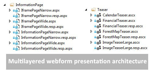
“Mobile last” strategy approach for ASP.NET Webforms with “Multilayered webforms presentation architecture” #MobileLast
Stuck on an old ASP.Net Webform solution? Without a responsive web? Then here is the simplest way to go responsive… without redoing all…
There can be several reasons why you just can’t upgrade, or you just don’t want a big project redoing all the web, involving editor redoing their content. If you’re pleased with your web, but missing a responsive site the easiest way is to only implement a responsive/mobile channel. Since you probably also stuck with Webforms instead of MVC, there is a way of implementing responsive channels without touching the web logic.
I haven’t seen many out there using this type of strategy, but I can tell it’s working, and in just one month we built our large scale site a new responsive mobile channel. This can applicable to all asp.net webforms project, and to EPiServer CMS 6. For later EPiServer version blog post coming soon.
Solution: Implement an alternate presentation layer and reusing the aspx code behind.
How can we do that? I call it “Multilayered webforms presentation architecture”
- For each .aspx and .ascx, make a .resp.aspx and .resp.ascx and point it to the same code behind. The .resp.ascx uses a masterpage with appropriate html and style. The resp.aspx uses reference to .resp.ascx. or original ascx (not all ascx needs to be changed if there only is CSS changes).

- Transfer the request to a “responsive” mobile template. With help of Server.TransferRequest method (not Request.Redirect). TransferRequest is transferring the request without the browser knowing anything about it, the browser request a page, but the server returns another page, in EPiServer, an other aspx-template.On each page code behind implement a logic in OnPreInit to transfer the page if you are on a mobile device.
protected override void OnPreInit(EventArgs e) { base.OnPreInit(e); Utilities.TransferResponsiveWeb(); } public void TransferResponsiveWeb() { this.TransferResponsiveWeb(Path.GetFileNameWithoutExtension(HttpContext.Current.Request.CurrentExecutionFilePath)); } public void TransferResponsiveWeb(string pagenameOrPath) { pagenameOrPath = Path.GetFileNameWithoutExtension(pagenameOrPath); if (!String.IsNullOrEmpty(pagenameOrPath)) { //Implement your own Logic in IsMobile for defining a mobile device //http://devblog.gosso.se/2016/10/implement-your-own-ismobile-check-with-handy-dev-functionality/ if (this.IsMobile && HttpContext.Current.Request.FilePath.ToLower().IndexOf(".resp.") < 0) { string str = pagenameOrPath.Replace(".aspx", ".resp.aspx"); str += (str.IndexOf("?") > 0 ? "&" : "?") + HttpContext.Current.Request.QueryString.ToString(); HttpContext.Current.Server.TransferRequest(str, true); HttpContext.Current.Response.End(); // stop, or less the page continues running } } } - Thats it! And it works!
Conclusion: With this mobile strategy approach you gain the following
- No need for immoderate contributions from editors (probably only the communication part)
- You could start with the most important mobile pages first, since the fallback is the desktop version.
- Quite small overhead to get started
- The URL in browser will be the same for the desktop site and in the mobile phone. Just like you want it.
- It opens the possibility to go full responsive with the new channel.
Downside: When you work in Visual Studio projects in your .resp.aspx page, and you add new server controls, it may override the designer.cs of the page, so be attentive.
Another TIP: you could put the OnPreInit globaly in a basepage-class (this is an EPiServer example)
public abstract class MobileComplientPageBase<T> : EPiServer.TemplatePage<T> where T : PageData

//and on your aspnet pages inherit it

public partial class MyPage : MobileComplientPageBase<EpiPageTypes.MyPageType>
